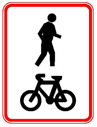
I talked a few weeks ago about the latest cycling developments up in the City of Sails, aka Auckland. One more issue that they are still grappling with, particularly as cycle numbers boom up there, is the heavy use of shared pathways for walking, cycling and any other “active travellers”. Many existing shared pathways were not built to a high standard (often essentially a re-purposed footpath), which might have been fine when there were few people cycling around the city, but now the growing demand is creating problems.
-1024x819.jpg)
-203x300.jpg)
The long-term fix in many cases will be to go back and either widen the existing pathway or provide separate facilities. In the meantime, Auckland Transport is engaging in a promotional campaign to encourage more consistent and courteous path behaviours by those walking and cycling.
A key tool is the use of shared path “pictograms” right on the path surface itself. Different ones target different users with different messages. For example, pedestrians are encouraged to keep to the left of the path (thus making it easier for faster-moving users to anticipate their movements and move safely past them). Similarly, cyclists are encouraged to ring their bells, so that others are aware that they are approaching.
-203x300.jpg)
Now I certainly have no problem with the messages being promoted; as we discussed recently, bicycle bells can be a useful device in the right circumstances. And it is very helpful to encourage a series of consistent path rules, like keeping left. I do wonder though whether the pictograms used here are just a bit too abstract for people to really get the message. Certainly it took me a while to work out what they were on about. You might have noticed too that in the photo above, the conventional path markings implied that pedestrians coming towards you should be on the right…
I suspect that shared pathways will be a major battleground around the country in coming years if cycling numbers continue to grow. Even if planners get new path facilities right, that still leaves a huge stock of existing shared pathways that are clearly inadequate even for current numbers. Already there have been grumblings elsewhere, and even a bit of a flurry of letters in The Press lately about it too (the recent debate about dogs near shared paths in Chch also highlighted another potential wrinkle). In the meantime, a bit of patience and tolerance would probably go a long way…
What do you think of Auckland’s shared path pictograms? Would they work in Chch?


Those signs are terrible.
I don’t think they’re too abstract, exactly: the white paint pictograms in the top picture are simpler, more abstract, and yet more comprehensible. The problem with these slightly more detailed pictures is that the relationships between the symbols aren’t immediately clear.
It looks as though someone has been inspired by the visual language of icons in a GUI, and forgotten that you can’t interact with paint to get more information. An aesthetic success, perhaps, but a semiotic failure.
Any signage or symbols must be very clear, frequent, consistent and maintained. There needs to be enough of them that the majority of people begin to comply with their intent, then the minority will feel the cultural pressure to follow the behaviours of others. Becomes win win for pedestrians and cyclists.
Presently most Chch routes fail in frequency or maintenance of signs, symbols or other infrastructure. The painted surface symbols don’t seem to last very long and aren’t repainted often enough. The divider posts seem to disappear within weeks and take months to be replaced. Green surfacing appears, new posts then shortly after the road gets resurfaced and it’s back to plain black, no posts and maybe a white line!